The state of South African wine label design
By Christian Eedes, 26 February 2016
-
Share:


3
Does South African wine packaging reflect the excellence of what most commentators agree is now appearing in the bottle? The second annual Wine Label Design Awards sponsored by Rotolabel and convened by winemag.co.za were announced last night (full resuls HERE) and the feeling among the judges (Rebecca Constable of Woolworths, designers Sean Harrison of Whitespace Creative and Carla Kreuser of The Jupiter Drawing Room, chef Liam Tomlin and me) was that the overall standard of the 50 entries was satisfactory rather than inspired.
Gold.
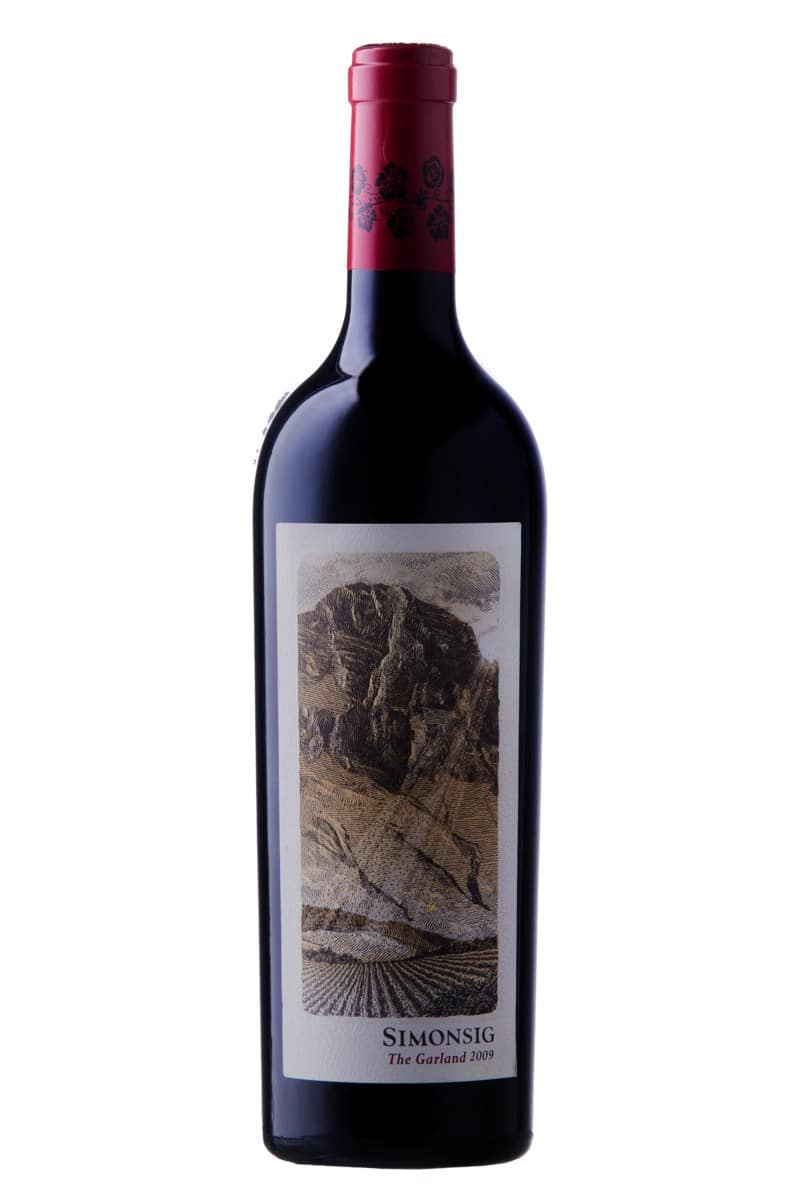
How to explain this? Much wine packaging tends to be classical, retaining traditional cues such as the family crest or homestead or some depiction of terroir. Everything centred, name of brand in elegant but predictable font above or below discreet illustration. Here the likes of Hamilton Russell Vineyards, Kanonkop and Meerlust come to mind – all very tasteful but hardly original. These could arguably come from anywhere in the world. It’s not to say that such work could never win (Simonsig The Garland 2009 which won a gold award this year is in this vein) but the craft applied in execution plus the production values have to be utterly uncompromising.
In contrast, there seems to be some more experimental work starting to emerge, the intention being to be more challenging of consumers. The danger, here, however is that many efforts in attempting to escape the safe and boring, quickly become incoherent or even nonsensical.
Work that succeeded brilliantly in challenging convention was the the Saboteur range from Luddite Wines and this also received a gold award from the judges. Closed with crowncap, a tag replacing the usual neck label and featuring particularly bold typography, it showed real confidence on part of both wine producer and design firm. Here were wines named “Saboteur” that disrupted both wine and design industries – an idea perfectly followed through in execution.
On the whole, however, there still seems to be quite a few factors holding back South African wine packaging. There is design for design’s sake and then there is brand building and local wine is on the whole a weakly branded category. Questions that might be asked of any wine brand are: What are its values? Where is it positioned in the market? Where is it sold and to whom? Branding is not about making wine into some mundane commodity but rather producer engaging with consumer for mutual reward – it’s remarkable that some of our most pioneering winemakers also have some of the most sophisticated packaging. Think of the all-Latin label of Eben Sadie’s Columella or the iron-fillings motif of Magnetic North Mountain Makstok from Chris Alheit…
Some further points: The worst packaging seems to be at the bottom end of the market, as if consumers who are on a tight budget don’t deserve any extra effort. Then there is the issue of labels from different produces looking way too similar and part of the reason for this is that there are studios that only do wine labels, brand owners in the wine industry inclined to consider them as specialist but when too much work is shared between too few creative minds conformity results. Most basically, there doesn’t seem to be enough of a dialogue between those in wine and those in graphic design.
Lastly, a more general observation. It is often impossible to separate the product from the country of origin when branding is at it is most successful. Scotch from Scotland, Tequila from Mexico, Bourbon from America. I would contend that the true face of South African wine is still not being properly conveyed when it comes to design.
-
Share:

Related articles
Reviews
Kanonkop Paul Sauer 2023
19 June 2026
Want access to this content? Reviews and Reports are initially reserved for subscribers. Get immediate access to exclusive insights and data. SUBSCRIBE NOW Already subscribed? Login
0
News
Francois Van Zyl resigns as Kanonkop winemaker
9 June 2026
Francois van Zyl has resigned from Kanonkop, where he had worked since 2022, to pursue his own interests. The news was announced in a post on the Stellenbosch estate’s Facebook...
3
Reviews
Meerlust new releases
12 January 2026
It might seem that Stellenbosch property Meerlust has entered a period of improved quality since the arrival of Wim Truter from KWV in 2020 to head up the cellar but...
Peter F May | 26 February 2016
Since the consumer is faced with many bottles in a wine shop/supermarket and cannot taste them then the front label is what must attract and do the selling. A label should stop the consumer scanning shelves in their tracks. If they pick up the bottle then it’s almost sold, and the back label should provide the conclusive info to make the sale.
Labels can either astonish or interest the customer looking for something new, or be recognisable to the customer who is looking to repeat a purchase.
The problem with changing a label to a newly fashionable design — which is for obvious reasons pushed by label design companies – is that today’s leading edge design is quickly copied by many others and becomes yesterdays boring, necessitating a redesign and so on.
Allow me — as is my wont — to take a contrary view to you.
Mention is made of Hamilton Russell Vineyards, Kanonkop and Meerlust as “hardly original”. That surely is the point. These are long established brands and their very design states longevity, reliability and stability.
A vertical tasting of any classed growth Bordeaux is not going to astonish. The label of 30 years ago is echoed in today’s. Maybe minor tweaks but basically the same.
Kanonkop’s tasting room is currenty selling, as well as the latest vintage, a 2006 Pinotage (10 years old) and a 1992 Cabernet (24 years old). The labels are barely different from the current one. To me, that is right and fitting for an Estate with such history and reputation. You can recognise a Kanonkop label and that is surely what it is all about.
Does the Saboteur range from Luddite Wines succeed “brilliantly in challenging convention”?. Really? It’s unmistakable in being a Luddite wine because it is basically the same label as Luddite has always had with the word Saboteur instead of Luddite. Why Niels Verburg paid a design company to come up with that label is a puzzle. Where the label does excel is not innovation but in duplication and thus signalling to anyone that it comes from the Luddite stable. Indeed, if it didn’t I could see a good legal case for ‘passing off’.
Wineries such as Warwick and Beaumont (one of the finalists) have modernised their labels by tweaking slightly, making the label fresher and clear while maintaining the lineage. Changes such as streamlining lettering, subtle enough not to shout out. Beaumont have changed the paper to a heavier textured label (thatcan be felt but not seen in an image) that reflects their whitewashed buildings while maintaining yet simplifying the text on the front label. Evolution rather than revolution.
Peter May
Author of a best selling book on wine labels and wine label judge at the American Wine Society National Conference.
ashley | 10 February 2018
What a brilliant response. As a graphic designer, I completely agree.
reinier | 15 September 2021
“Evolution rather than revolution.” Great read!