Melvyn Minnaar: Rosé and the relative nature of “pink”
By Melvyn Minnaar, 3 June 2021
-
Share:


The colour in which a rosé presents itself is one of the inevitable talking points when such a wine is poured at summery tables of wine pals in a Mediterranean mood. We all have specific opinions about the perfect shade a rosé should be to fulfill a specific requirement: pleasing the eye, nose, and palate in synaesthetic harmony. And we love to talk about it.
‘Orange wines’ (oddly-named, signifying ‘natural’ or something such), I suppose, probably also call attention to its looks, but somehow, given its odd nomenclature, ‘tis often neither here nor there exactly what the hue should or could signify.
Rosé wines, however, call for precision. So when is a rosé a rosé and not called by any other name? Not as simple as you may think. When blanc de noir was all the rave in those happy party days of yore (take a bow Boschendal) some hardliners took their magnifying glasses to the table to inspect whether there is forensic truth and proof to the level of pink.
So the consensus about the pinker shade of pale is a party game without a winner. Yet the guys from Provencal, which have won the love of the world for pink wine, without really having anything else to offer, aren’t taking the tone lying down. Already masters of hype, some vigerons are all in for the colour gambit.
And who better to draw into the game than the grandmasters of tonal color (sic!), the fabulous Pantone soothsayers themselves.
Pantone, as anyone in the fashion, print, and design industries know, is the go-to when it comes to colour and its shades, tones, and inflections. Founded in the 1950s by enterprising advertising and printing executives in New Jersey, USA, their famous standardised colour-matching system allowed printers to match ink pigments precisely to designer and client specifications. Cute little books of patches were in all graphic designer pockets before the time of digital communication. But Pantone is still the leader of colour (sic).
And so it was that Jacques Bouey, boss of a well-known Bordeaux family wine company, called in the Americans from New Jersey to match their rosé wines to defined and exact Pantone specifications. Taking the marketing gap, the pink wines are labeled ‘Colors’. The merlot rosé (AOP Bordeaux) is ‘Colors 721’ and the grenache (IGP Méditerranée) is ‘Colors 719’.
So what do these Pantone ‘colors’ look like? The beige make-up tone that shows up on my computer for Pantone 721 doesn’t inspire an urgent desire to get hold of a bottle of Colors rosé, but at least Encycolorpedia.com’s description is fun: “The hexadecimal color code #dfa880 is a medium-light shade of orange. In the RGB color model #dfa880 is comprised of 87.45% red, 65.88% green and 50.2% blue. In the HSL color space #dfa880 has a hue of 25° (degrees), 60% saturation and 69% lightness. This color has an approximate wavelength of 585.23 nm.”
Perhaps I’ll get on that wavelength when I smell and see, but meanwhile, I’d rather take super sommelier Higgo Jacob’s words for the ideal rosé look: “Bright, star-bright, pale rose-gold in the centre with a wide, transparent variation towards the outer edges which holds just a lingering thought of pink.”
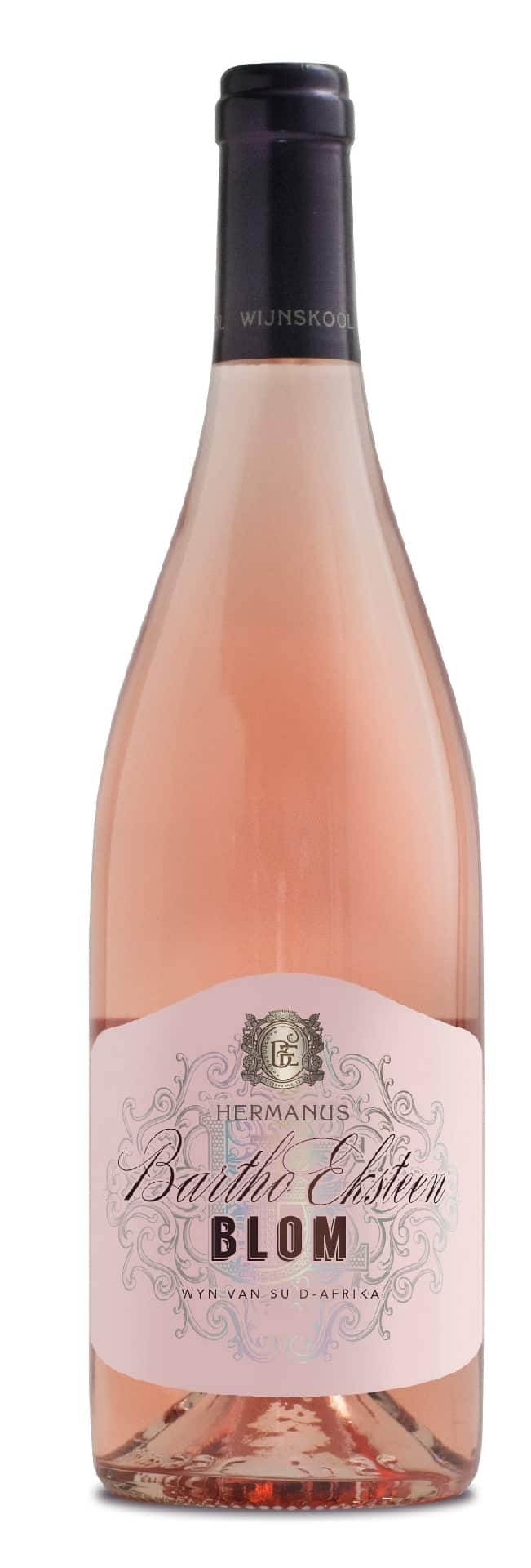
Bartho Eksteen, who, according to the recent Platter’s guide (cover: Pantone green 376C) is the country’s top rosé maker, suggests the colour should be coral pink, although when a friend suggested “naked pink”, he liked it. He says the wine must not be too dark, otherwise, it starts showing “red wine characteristics”.
So check out the just-bottled grenache-driven 2021 Provençal blend deliciously named ‘Blom’.
An altogether different colour kaleidoscope comes into place when the aim is a bottle-fermented rosé. Imagine the talent, fine-tuning and foresight required to achieve the right tone after the various processes and time required before you pop a vintage rosé MCC.
Pieter Ferreira says it’s all a joyful challenge.
For the Graham Beck NV the team uses natural enzymatic colour extraction from the pinot noir bunches before it goes into the press. With the deeper colour of the batches of base wine, they can blend (with the chardonnay) the constant, specific “unique silver-pink hue”.
The vintage version takes a different tack (expressing vintage) when four loads of pinot noir and one of chardonnay are pressed together. With less colour extraction the result is what he calls a “perfect salmon pink”.
I have an idea that “salmon”, “silver”, “coral”, “naked” or “lingering thought of” pinks are all in the eyes of the beholder, not to mention the Pantone chart. I mean: otherwise why would we be staring and talking so much about rosé?
- Melvyn Minnaar has written about art and wine for various local and international publications over the years. The creativity that underpins these subjects is an enduring personal passion. He has served on a few “cultural committees”.
Help us out. If you’d like to show a little love for independent media, we’d greatly appreciate it. To make a financial contribution, click here. Invoice available upon request – contact info@winemag.co.za
-
Share:

Related articles
Opinion & Analysis
Melvyn Minnaar: Those quirky international wine days
1 July 2025
A few weeks or days ago it was International Potato Day. I didn’t know about it. Perhaps you did – I mean we are all fans of the mashed, the...
Opinion & Analysis
Melvyn Minnaar: A reawakening for Stellenbosch – wine, culture, and the Triennale
1 May 2025
In a different era, there would have been cheer, perhaps some pleasant collegial backslapping, but certainly a limited-release wine with a special (arty) label. If it was still alive, SFW...

2
Opinion & Analysis
Melvyn Minnaar: Afrikaans as part of local wine’s USP
3 March 2025
Without falling into the rabbit hole of its politics, it is a fact that Afrikaans became an official language, one of two, in the then Union of South Africa in...
Comments
0 comment(s)
Please read our Comments Policy here.