Some thoughts on the Wine Label Design Awards
By Christian Eedes, 1 April 2017
-
Share:


It’s difficult to be optimistic on a morning when you awake to find that President Zuma has administered a cabinet reshuffle that only bodes ill but the results of the third annual Wine Label Design Awards sponsored by Rotolabel announced earlier in the week suggested in some small way that the future for South Africa is not entirely bleak.
If the overall quality of the work entered for this competition in the first two years had been no more than fair, it was of a much higher standard this time around. The question has always been whether or not the South African wine industry manages to convey a compelling sense of self to consumers via its branding and until now the answer has been probably not. This, however, finally seems to be changing.
Consumers are looking for brands that deliver some kind of experience and in the past, they were treated to family crests and illustrations of homesteads at best or Ndebele patterns, bushman drawings and “critter” imagery at worst.
This time around, however, there was a sense that the true, deeply characterful face of South African wine was finally being conveyed. Instead of the predictable, we had an array of labels, some more unconventional than others, but all fundamentally connected to the earth and with a real authenticity about them.
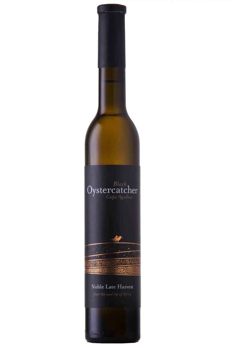
Grand Prix winner.
The Grand Prix which went to Black Oystercatcher Noble Late Harvest 2014 (Anthony Lane Design Consultancy) featured a gold-on-black illustration of said bird on the shores of Elim, this wrapped around an elongated and supremely elegant bottle, the effect being to transport you to the place from which the wine originated as well as evoking the sweet wine inside. It was therefore utterly effective in communicating both extrinsics and intrinsics.
Among the golds, David Nieuwoudt Ghost Corner The Bowline 2015 (Haumann Smal Design Studio) featured an image of a “ghost ship” again arousing the wild and windswept ward of Elim from which this wine also comes, the carefully judged typography providing a sense of thoroughness and attention to detail in the production of the wine.
Thistle & Weed Duwweltjie Chenin Blanc 2016 (Fanakalo) with its abstract illustration of fynbos and gold-flecked thorns spoke of the rugged beauty of the winelands while Christoffel Hazenwinkel series of wines from Hazendal with their zany Donnie Darko-like rabbit men was massively daring and sure to appeal to a certain subset of younger wine drinkers (all the medal winners are available for viewing here).
In the past, it often seemed we were too burdened by our own history to successfully harness it to define ourselves, and instead resorted to clichés and pandering to preconceptions. All of a sudden, however, our heritage and culture in all its multifarious forms is no longer being denounced but rather embraced by brand owners and designers alike, the result being packaging not just of style but possessing real substance. Our national politics might be looking grim right now but open a bottle of world-class wine with world-class packaging tonight and tell yourself all hope is not lost.
-
Share:

Related articles
Opinion & Analysis
Michael Fridjhon: The Tim Atkin Special Report and the question of independence
10 June 2026
The news, announced recently by Wines of South Africa (WOSA) to its members, that henceforth producers would have to pay to have their wines rated by Tim Atkin MW for...

3
News
Francois Van Zyl resigns as Kanonkop winemaker
9 June 2026
Francois van Zyl has resigned from Kanonkop, where he had worked since 2022, to pursue his own interests. The news was announced in a post on the Stellenbosch estate’s Facebook...
1
Opinion & Analysis
Editorial: Wine’s problem isn’t storytelling – it’s relevance
8 June 2026
The South African wine industry is deep in introspection, as it no doubt should be. At both the recent Wine Summit organised by industry body South Africa Wine and the...
Comments
0 comment(s)
Please read our Comments Policy here.