Tim James: On the Alheit Vineyards labels
By Christian Eedes, 9 July 2018
-
Share:


1
There would be little point, I think, in my setting forth a series of notes and comments on the latest range of Alheit wines, as Christian has already greeted them with the adulation and enthusiasm that I also feel for them. The only real point of difference would be that I would put Radio Lazarus on the same level as the other single-vineyard wines (though leaving Huilkrans perhaps just ahead). To me, the release of Sadie’s Ou Wingerdreeks 2009s was probably the most important single event of the modern Cape wine revolution. The Alheit 2017s cannot be of that breakthough significance, but they constitute a memorable and perhaps unprecedented achievement in a range of Cape white wines.
It occurred to me, though, that something could be said about the labels of at least the new wines. I have always admired the Alheit wine-names and labels, which seem to me to show the intense quality of passionate involvement that the wines themselves do. Chris and Suzaan Alheit chose the route of radical difference in appearance (unlike the Ouwingerdreeks, for example, which brilliantly plays subtle typographic variations on a theme): all are unique, all individual responses to the wines’ origins. The names are genuinely meaningful, some found after quite a bit of struggle, I know.
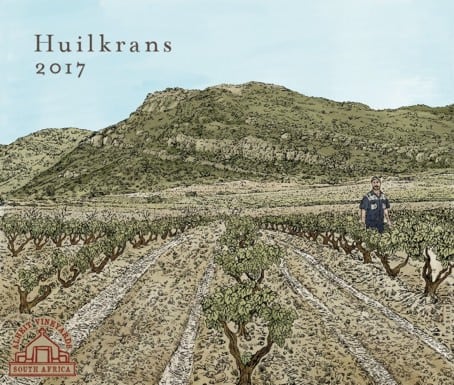 Of the three new labels, the most straightforward is Huilkrans – perhaps because it appears that the name was chosen by the Vissers, owners of the Skurfberg vineyard where the grapes are sourced. Huilkrans is the name of a cliff on the farm that “weeps” when it rains. It acquired added meaningfulness with the untimely death of the Vissers’ son, in the year of this maiden vintage. The krans is shown in the charming drawing (looking rather greener than I’ve ever seen it!), together with the rows of bushvines and tractor tracks in stony soil. Don’t look too minutely at the little person in blue, however, or you’ll see that he doesn’t have any legs: he’s a head and torso hovering above the vines!
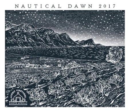 With Nautical Dawn, we get more involved, more poetic and complex (more Alheitish, in fact). Chris says that the vineyards are “very close to the False Bay coast of Stellenbosch. So close that on a clear day you can see the waves breaking”. That’s what’s shown in the monochrome, woodcut-like drawing: the bushvines, the curve of the bay with choppy waves, and the Stellenbosch mountains leading to Hangklip on the right. A starry, starry night, it is – or twilight, rather, with the technical term “nautical dawn” underlining the influence of the sea on the vineyard. And the image of dawn is of obvious relevance to a new wine in a vintage that seems to be a breakthrough for the Alheits. But it’s also a conjunction of scene, time and mood with personal significance for Chris.
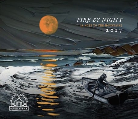 With these two labels, the images directly relate to the terrain, but not so with Fire by Night. The wine is from Paardeberg grapes (and there’s a small subname on the label: “A note to the mountain”), and Chris regards his first Paardeberg wine as a kind of homage to this mountain, which was in a very real way the Swartland cradle of the crucial development in the Cape wine revolution: the place where Eben Sadie and Tom Lubbe (of Observatory) made wines from the first years of this century, and were joined by other pioneers – notably the Mullineux and Adi Badenhorst – and whose old vineyards, mostly chenin, now provide grapes to a small host of fine winemakers. So it’s also a homage to the pioneers. “Paardeberg holds a mythical place in our minds”, say Chris and Suzaan Alheit.
But why a scene of a small boat at sea? And why this name? “Fire by night” in fact alludes to the biblical story of the Israelites’ exodus from bondage in Egypt, guided by a God-sent pillar of cloud by day and a pillar of fire by night. The latter is conveyed by the vertical orange band of the moon and its multiplied reflection on the sea. The sense is one of isolation and of effort, with the lone figure in the boat pulling hard at the oars. As Chris says, there’s a long way to go, but the direction is clear, and the task is not impossible. Incidentally, almost invisible without a magnifying glass (or, let it be admitted, a larger on-screen version of the label) is an inscription on the boat’s gunwale: Mark 4:35-41. This is another Biblical allusion – to the story of Christ calming a stormy sea. No doubt adding to the religious Alheits’ sense of guidance.
It’s what’s in the bottle that counts. Of course. But sometimes, as with all the Alheit wines, what’s outside the bottle can marvellously convey the spirit of how the wine got there.
- Tim James is one of South Africa’s leading wine commentators, contributing to various local and international wine publications. He is a taster (and associate editor) for Platter’s. His book Wines of South Africa – Tradition and Revolution appeared in 2013.
-
Share:

Related articles
Opinion & Analysis
Tim James: How much power does Stellenbosch Cab need?
13 July 2026
If you offer yourself as a wine critic there’s firstly objectivity to at least consider. It’s something only achievable once you understand your own instinctual or acquired preferences; if you...
4
Opinion & Analysis
Tim James: Single-vine wines and collateral damage
7 July 2026
We can safely assume that few wine countries or regions have specific legislation about wines made from, um… single vines. In fact, I’d venture a guess that just one does....
1
Opinion & Analysis
Tim James: A handful of reds under R175 – with a few triumphs
22 June 2026
I could say that this little exercise was purely because I thought there must be people out there who’d welcome some recommendations at comfortably below R200, willing to slum it...
Kevin R | 9 July 2018
Taking Fire by Night deeper, the ‘note to the mountain’ most likely refers to both God and the Paardeberg.
Great article.